Data Unavailable
The Student News Site of Landmark College

VOICES

VOICES

VOICES

Emily Dickison House

My Favorite Maps – Valieriepieris

My+Favorite+Maps+-+Valieriepieris

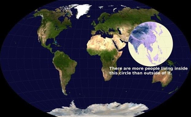
This map here shows a crazy statistic about the human population: There are more people living inside the circle than outside of it. This map could be used to show the population density of the world, as it shows us that most of the world’s population lives in southeast Asia. This map is known as a Valieriepieris Map, and it gets its name because it was first created by a Reddit user named Valeriepieris in 2013. I like this map because it shows the massive number of people that are living in Asia, and how the human population is not as evenly distributed as you might think it would be.

Image Source: https://brilliantmaps.com/population-circle/

Leave a Comment
More to Discover
About the Contributor
Josh Hancock
Josh Hancock is currently a liberal studies major at Landmark College, and this is his second semester at Landmark. Josh likes to learn things by researching them online, and he also likes to try new things. He likes to contribute to things and help people out, so he likes helping contribute to LC Voices

Comments (0)

All LCVoices Picks Reader Picks Sort: Newest

Your email address will not be published. Required fields are marked *